


The Fifty-Dollar Fix That Makes a Simple Website Look Like a Million Dollars
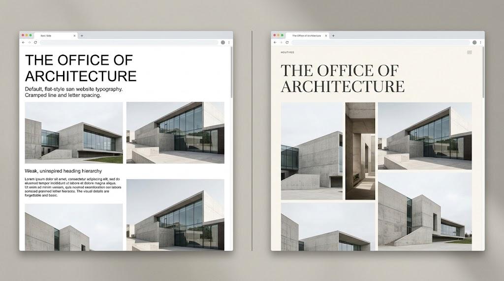
Not every website project starts with a generous budget. Many creators find themselves working with limited funds, relying on templates or hiring freelancers rather than commissioning a full agency build.
The aspiration, however, remains ambitious. You want the finished product to rival sites that cost multiples more. The question is how to bridge that divide without a proportional increase in spending.
The answer lies in typography. A single deliberate typeface choice, applied across a clean and functional layout, does more to transform perception than almost any other visual decision.
The Pattern That Gives Away Budget Sites
There is a recognizable fingerprint on most budget-built websites, and it stems directly from their typography choices. The same free typefaces appear again and again across countless pages.
Arial, Roboto, Helvetica, and Open Sans are the predominant culprits. They come pre-loaded in browsers and website builders, requiring no licensing and no implementation effort.
Their functional quality is genuinely good. They render clearly across devices and accommodate a wide range of content types. Nothing about them is technically deficient.
The deficiency is perceptual. Their universal deployment makes them invisible. A visitor who has browsed several sites already that day carries no memory of yours because nothing about the text felt distinct.
If you hire a cheap website designer, expect this default approach unless you raise the subject. Custom typefaces demand purchasing licenses, preparing font files, and writing additional CSS. These are steps that most budget-scope agreements simply do not include.
Your brand ends up wearing the same visual uniform as hundreds of competitors. Nothing about the typography communicates value or distinction.
The Role Typography Plays in Premium Branding
Take a close look at the websites operated by luxury brands. You will notice that their layouts are not elaborate. Their copy is not dense. Their navigation is not overloaded.
Instead, these sites rely on two key elements to establish their position: striking imagery and carefully selected typography. Together, these components communicate brand tier before any product detail is even encountered.
If professional photography is beyond your budget, stock images step in as your visual base. This places disproportionate importance on your typeface, since the text becomes the primary element visitors evaluate.
The response to typography is emotional and nearly instantaneous. The curves, weights, and spacing of your letters trigger cognitive associations before anyone reads a single sentence.
Changing your typeface does not merely alter a cosmetic detail. It reshapes the entire framework through which visitors interpret your business and its credibility.
One Typeface Purchase, One Immediate Shift
You do not need a font subscription or an expansive library of typefaces. A single quality display font is all that is required.
Display typefaces are designed for large-format text: hero banners, section titles, and any content meant to dominate the visual hierarchy. Browse repositories like Fontspring or MyFonts to find options that suit your needs.
Seek out a sans-serif or serif that possesses character in its construction. Distinctive proportions, unique terminal shapes, or interesting geometric qualities all contribute to a typeface that feels purposefully chosen rather than randomly defaulted.
Purchasing a commercial license for the weights you need generally costs between 30and30and50. That expenditure alone places your site ahead of the vast majority of template-driven pages that depend entirely on free fonts.
The shift becomes apparent the moment your display font goes live. Your headings project a personality and confidence that no standard typeface can deliver.
Constructing a Balanced Font Pair
Your premium display typeface should appear only in large, prominent text. These fonts are engineered for visual impact at scale. At paragraph sizes, their defining details become muddled or illegible.
For body copy, select a free sans-serif that was designed specifically for screen reading. Inter is an excellent selection. System UI provides a dependable browser-native option.
The interaction between an expressive heading font and a restrained body font creates the impression of expense. One draws the eye with authority. The other communicates without causing visual fatigue.
Two typefaces is your ceiling. Introducing a third or fourth font fractures the visual language and makes the page feel chaotic. Discipline in font selection is a universal characteristic of professional-grade design.
Spacing Decides the Outcome
The right typeface in poorly arranged text still reads as amateur. The relationship between letterforms and the space surrounding them is a core component of typographic quality.
Body text requires a line height of approximately 1.5 to 1.6. This ensures each line is clearly separated while maintaining a natural reading rhythm. Denser leading creates a cramped feel that discourages continued reading.
A slight increase in letter spacing on your headings can noticeably elevate their appearance. This minor adjustment adds a layer of sophistication that distinguishes intentional typography from defaulted typography.
The size contrast between headings and body text must be pronounced and purposeful. A hierarchy that barely differentiates sizes communicates timidity. Premium typography is assertive. Make your headings bold and unmistakable.
Color That Reinforces Rather Than Distracts
Refined, high-end websites often use remarkably few colors. Near-monochrome palettes are a common choice because they keep the visual focus on typography.
Dark charcoal text on an off-white background delivers a comfortable, sophisticated reading experience. Pure black on pure white, by contrast, creates a harsh contrast that becomes tiring during longer sessions.
Links and buttons need to be clearly identifiable from the surrounding content. They do not need to be visually loud to accomplish this. A single, understated accent color is enough to direct user interaction.
When your typeface carries genuine personality, color becomes an auxiliary element. The letterforms themselves hold attention, making elaborate palettes superfluous and potentially counterproductive.
Delivering Your Font Efficiently
Purchasing the typeface is step one. Ensuring it reaches every visitor quickly and reliably is step two.
Self-host the font files on your server. This approach eliminates a third-party dependency from the critical loading path and provides you with direct control over delivery timing.
Font purchases include files in .woff and .woff2 formats. Place them in your project directory and declare them using a standard @font-face rule in your CSS.
A site that renders custom typography without delay communicates reliability and professionalism. A site that briefly flashes unstyled text before the font loads conveys the opposite. The speed of text rendering directly shapes how polished a site feels.
Accounting for the Unpredictable
Font files can and do fail to load. Network interruptions, server timeouts, and file corruption all represent real possibilities that your design should address.
Pair your primary typeface with a fallback that mirrors its general classification. A geometric sans-serif should default to Arial or Helvetica. A serif should default to Georgia.
This strategy ensures that even in a failure scenario, visitors encounter a clean and readable page. The specific character of the typography shifts, but the overall structure and professionalism hold firm.
Periodically verify this by blocking the custom font file through your browser's developer tools. Reload the page and confirm that the fallback maintains an intentional, composed appearance.
Influencing the Build When You Are Not the Builder
If someone else is responsible for constructing your site, you still hold significant influence over its visual direction. The key lies in communication and timing.
When you evaluate affordable web design packages, lean scopes are the norm. Template-based projects typically rely on whatever the platform provides out of the box, typography included.
Take initiative by purchasing a font license independently. Provide the files to your developer and request that they implement the typeface across all headings with an appropriate companion for body text.
Most builders respond positively to this kind of specific direction from clients. It streamlines their workflow and elevates what can be delivered within a limited scope. Your modest investment raises the quality ceiling of the entire project.
The Speed of First Judgment
Visitors assess your website before they engage with any written content. The visual texture of the typography plays a major role in this near-instantaneous evaluation.
Typefaces that are ubiquitous across the web trigger assumptions of anonymity and low investment. Typefaces that feel distinctive and deliberate trigger assumptions of care, quality, and credibility.
This response is conditioned by years of online browsing. We have internalized a connection between custom typography and brands that invest meaningfully in their presentation.
That connection now benefits anyone willing to make a targeted, modest investment. A single typeface choice can position your site alongside brands with far more generous budgets. The underlying psychology has not changed. Only the cost of access has decreased.
Final Observations
A polished, professional appearance on a modest budget hinges on making strategic choices about where visual investment matters most. Typography consistently delivers the highest return.
One well-chosen typeface can disguise the simplicity of a basic layout, elevate the impact of stock imagery, and give your brand a visual voice that is entirely its own.
When you explore affordable web design for your next project, incorporate the cost of one quality display typeface into your planning from the beginning. The expense is minimal. The transformation is significant.
Abandon the defaults. Choose a typeface with intention, pair it with a clean body face, and implement it with care. The difference visitors perceive will be immediate and lasting.

 English
 Arabic
 French
 Spanish
 Portuguese
 Deutsch
 Turkish
 Dutch
Dutch
 Italiano
 Russian
 Romaian
 Portuguese (Brazil)