


Reading a Bare Website: Signs of Thoughtful Restraint and Signs of Neglect
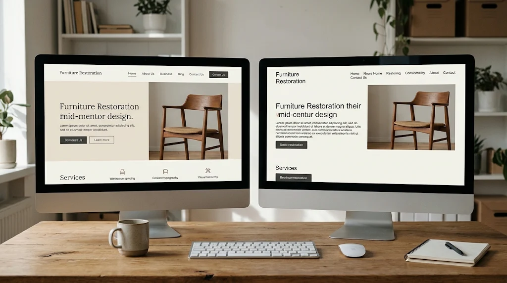
A bare website can feel confident or careless. The same white space, the same few photographs, the same short text can produce opposite impressions. The difference becomes clear when a visitor tries to do something specific.
Screenshots often hide that difference. Two pages can look equally quiet and still behave very differently. One answers a question in a couple of clicks. The other sends the visitor searching.
Businesses comparing cheap website design services run into this problem regularly. A stripped-back site can be a sensible choice for a small firm with a simple offer. It can also mask missing detail, uneven layouts and forms that were never tested.
The test is not how little a site contains. The test is whether what remains helps someone act. A short page that answers a question is working. A short page that hides the answer is not.
A visitor's task should shape the page
Minimal design starts with the visitor's job. The designer identifies what someone needs and removes anything that competes with it. That calls for judgment, not just restraint.
Consider a clock repair workshop. Customers likely want to know which movements are serviced, whether house calls are offered and how to request an estimate. A modest site could meet those needs with a service list, a few photographs and a contact form. Nothing more would be essential.
Animation, a video header and a deep menu might all be absent. Those omissions would remove noise rather than useful detail. The savings should come from what is left out, not from what is left unfinished.
Now picture a similar page with stock images and a line about "timekeeping excellence." Visitors still cannot tell whether the workshop handles antique clocks, modern watches or both. The page has lost information, not gained clarity. Restraint should protect answers, not erase them.
Repeated details reveal the level of care
Uneven detail is easy to sense without design training. A heading may sit close to the text on one page and float far above it on another. Buttons may change shape, and images may use mismatched proportions.
On a sparse page, those inconsistencies draw the eye because little else competes for attention. Visitors may not name the problem, yet they notice that something feels unsettled.
A careful layout creates a steady rhythm. Related items stay together, headings introduce what follows and similar buttons look and behave alike. That discipline does not require expensive effects. Affordable web design can still deliver consistency when one system is applied across pages.
Templates remain a reasonable way to control effort. Problems arise when a business is pressed into a template without changes to image sizes, text lengths or page structure. A layout built for a photographer's portfolio may need rework before it suits a knife sharpening service. The template is not the issue; the lack of adaptation is.
Empty space should reduce effort
White space can separate ideas and help a heading stand out. It can also leave a reader unsure where to look next.
Imagine a service page where a large heading fills the first screen, followed by a wide gap and one sentence. The visitor must scroll to learn what the company offers. The layout may look striking in a screenshot, yet feel unhelpful during a visit.
Useful spacing makes relationships obvious. A caption sits near its image, and a specification stays close to the product it describes. An enquiry button appears once enough information has been given.
The right density depends on content. A gallery can be open and airy, while a comparison table may need a tighter arrangement. Spacing should follow the reader's task rather than a visual trend. Space should shorten the distance to an answer, not delay it.
Brief copy must still settle real questions
Concise writing takes editing. Removing words is easy; preserving meaning takes care.
"Guidance that fits" tells a reader almost nothing. "Bookkeeping support for sole traders" names the service and suggests its scope. The second line does more work in a similar amount of space.
The same principle holds beyond the homepage. A service note should explain what is included, and a product page should supply details needed to judge suitability. Contact information should make the next step obvious.
Some businesses need more explanation than others. A cake maker may need only a gallery and contact form. A lab supplier will likely need specifications and supporting documents. Affordable web design should be judged by usefulness rather than word count. Look for text that earns its place and keeps the facts a customer needs to decide.
A phone test exposes what a desktop preview hides
A desktop preview shows only part of the work. Open the site on a phone and try a normal task.
Find a service, browse examples, read the contact details and send a test enquiry. A tidy row of cards may collapse into an awkward stack. A floating button may cover the form it is meant to open.
Notice the less attractive moments too. What happens when a required field is left empty, and does the form explain the issue? After submission, does a clear confirmation appear? A form that fails silently leaves the visitor unsure whether anything happened.
Accessibility deserves the same scrutiny. Hidden form labels may tidy an appearance while making fields harder to understand; W3C guidance recommends labels that describe each control. Pale text may look refined but can be difficult to read, so contrast guidance matters.
A simple site should remain usable through typing, tapping, mistakes and smaller screens. Cheap website design services often show their limits at exactly those points. The phone test makes those limits visible before visitors encounter them.
A narrower brief suits a smaller project
There are practical ways to reduce website work. A business can launch with five prepared pages rather than fifteen.
It might use a standard gallery, supply approved photographs or delay a booking system until demand justifies one. Those choices cut effort while protecting essentials. They also leave time for testing.
Trouble starts when promised scope stays ambitious while time for planning, content and checking disappears. All fifteen pages arrive, yet several contain repeated text or unchecked layouts. That outcome is common when affordable web design is treated as a volume exercise.
Ask providers what they will deliver, including which pages and functions are included. Ask who prepares and uploads the content. Ask what will be checked before launch. Clear answers make trade-offs visible.
"Content upload included" could mean placing supplied text into a template. It could also mean formatting headings, arranging images and reviewing every page. Those represent quite different amounts of work.
A narrow scope with proper checks usually serves visitors better than a broad promise that runs out of time. A modest proposal needs context, and so does a larger one.
Judge what the site lets people do
A useful final check is to give an unfamiliar person a specific task. Ask them to find a service, locate relevant work and explain how they would enquire.
Watch where they hesitate, and resist the urge to guide them. This exercise will not replace professional testing, but it can expose obvious gaps. A missing service description or a buried contact route tends to surface quickly.
A handsome homepage has limited value if visitors cannot work out what the business does. Minimalism leaves enough information and a clear route forward. It respects the visitor's time by removing obstacles rather than removing evidence.
False economy appears when necessary work has been skipped: the unexplained service, the awkward mobile layout, the form nobody tested. When comparing cheap website design services, look for evidence of care in the pages people can actually use. A modest site can be complete, distinctive and carefully made.

 English
 Arabic
 French
 Spanish
 Portuguese
 Deutsch
 Turkish
 Dutch
 Italiano
 Russian
 Romaian
 Portuguese (Brazil)